
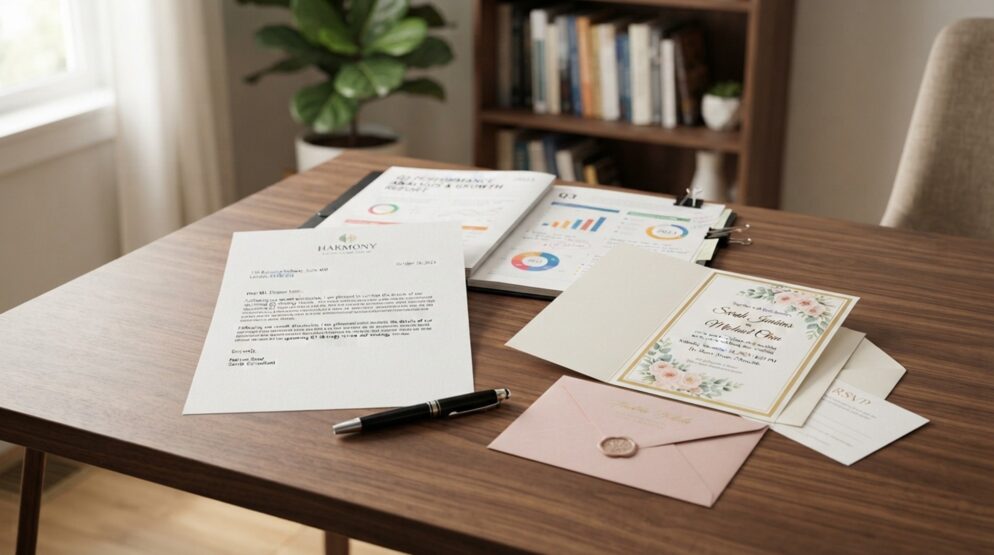
An invoice, a wedding invitation, and an unfolded report need custom envelopes built for different tasks. Business correspondence needs clear routing, while wedding invitations place more weight on presentation. A report needs enough room to arrive without unwanted folds.
The opening edge is the side through which you insert the contents before closing the flap. Size, construction, and printed details must work with the contents and delivery method. You can match those choices without sacrificing the look you want.
Key Takeaways
- Choose construction around the contents and how you will insert them.
- Measure the complete stack, not just its largest sheet.
- Keep address information clear and easy to read.
- Separate style choices from windows, closures, and privacy features.
- Test a finished sample before approving an order.
An attractive design can still fail if the insert does not fit or the address cannot be read. Those practical needs point toward the main style families.
What Are the Different Types of Custom Envelopes?
The different styles of envelopes include commercial, A-style, baronial, square, booklet, catalog, and remittance envelopes. These seven common families describe different combinations of shape, opening edge, flap design, and purpose. They do not form seven sealed categories with no overlap.
A window or security tint can appear on more than one style. A security tint is an interior privacy pattern that reduces show-through. A transparent address opening is an address window, regardless of the envelope around it.
| Style | Defining feature | Typical use |
| Commercial | Elongated business format | Correspondence and invoices |
| A-style | Square flap | Cards and announcements |
| Baronial | Pointed flap | Formal social stationery |
| Booklet | Long-edge opening | Brochures and reports |
| Catalog | Short-edge opening | Flat documents |
Square envelopes describe an outer shape with equal height and width. Remittance envelopes describe a response function, often pairing a payment pocket with space for written details. Neither category replaces the need to choose paper, dimensions, and a closing method.
The common types by shape and style provide a useful starting point, not a universal count. A single product can belong to a style family and carry several added features. Its full description tells you more than any one category name.
A frequent mistake treats peel-and-seal, windowed, and commercial as mutually exclusive types. A commercial envelope can include both an address window and a peel-and-seal closure. These terms answer separate questions about envelope construction and use.
Start by naming what the envelope must carry and how the recipient will receive it. Then choose the family that supports that task before adding optional features. Routine letters and invoices make everyday business correspondence the clearest place to begin.
Commercial Envelopes for Branded Business Mail
A customer receiving a routine invoice should recognize your business without struggling to find the mailing address. Commercial envelopes suit routine correspondence, invoices, and customer communications because their business format keeps the task familiar. Branding should support that function rather than compete with it.
Business Envelopes With Logo and Return Address
Business envelopes with logo and return address combine recognizable identity with information for returning undeliverable mail. The printed business identity tells the recipient who sent the letter. The return address tells the postal service where unsuccessful deliveries should go.
Choose custom business envelopes with logo placement that leaves recipient information visually distinct. A restrained corner layout can group the logo and return address without taking over the front. This approach often suits invoices, account notices, and other practical communications.
A larger marketing treatment gives a campaign more visual presence but needs a clear boundary around mailing information. Keep a slogan from looking like another address line. The recipient should not need to interpret the design to find the destination.
Brand Colors and Legible Typography
Legible type and strong contrast help branded stationery work as mail, not just as a design sample. Use a plain, readable font for essential address information. Save a decorative brand font for the logo or a short message.
Brand colors can look different on the chosen stock than they do on a bright screen. Review the printed result with the paper color in view. Pale lettering and fine strokes need special care because they can lose definition.
- Inspect the smallest text at actual size.
- Test reversed lettering against the background.
- Review a grayscale version for weak contrast.
Reversed lettering uses light text against a darker printed area, which can expose weak edges in small characters. Keep color use consistent across the envelope and enclosed letter. Invitations can place more emphasis on expressive presentation, starting with the flap itself.
A-Style and Baronial Envelopes for Invitations
A square flap and a pointed flap offer different looks, not strict rules about which occasions qualify. A-style envelopes give invitation stationery a clean-lined appearance, while baronial envelopes often suggest traditional correspondence. Either can carry a wedding invitation when the complete set fits.
A-Style Invitation Envelopes
A-style envelopes commonly use square flaps for announcements, greeting cards, and wedding stationery. Their straight flap line works well with simple layouts and modern card designs. The style does not require a casual tone or a particular kind of event.
Choose the envelope around everything you plan to send, including smaller pieces tucked behind the main card. A wedding invitation with a reply card and details card creates more bulk than the invitation alone. Any reply envelope also belongs in that stack.
Keep the pieces in their intended order when judging how the set enters the pocket. A card that slides in easily alone may catch against another card during assembly. The full stack also changes how neatly the flap meets the back.
Baronial Envelopes
Baronial envelopes typically have pointed flaps associated with traditional social stationery. They suit personal notes and formal-looking invitations, but formality is not a requirement. A simple printed card can use the pointed shape without adopting ornate lettering.
Flap shape does not establish usable capacity, so do not infer extra room from a pointed or square silhouette. The pocket dimensions and assembled contents determine practical fit. Neither style automatically holds a thicker set merely because its flap looks larger.
A liner can add color inside the flap, but it can also reduce flexibility or add bulk. Account for the lined envelope rather than judging an unlined sample. The difference matters most when several inserts already fill the pocket closely.
Match the flap to the visual character of the stationery after you establish room for the complete set. Keep the outer shape separate from that flap decision. Square envelopes change the whole outline, not just the line across the back.
Square Envelopes and the Mailing Trade-Off
A square silhouette can change how a mailed piece is processed, even when the design looks simple. Square envelopes have equal height and width, giving boutique branding and event announcements a distinct outline. That visual choice brings a postal consideration that rectangular stationery may avoid.
The USPS letter aspect ratio compares the mailpiece’s length with its height. Machinable letters require a ratio from 1.3 to 2.5, while a square has a ratio of 1.0. A square does not meet that criterion.
Nonmachinable mail does not have one universal postage outcome across all square pieces. Mail class, dimensions, weight, thickness, and flexibility affect postal treatment. Confirm classification with USPS for the finished mailpiece rather than relying on shape alone.
- Place a square card inside a rectangular envelope.
- Reserve square envelopes for hand delivery.
- Keep the outer mailpiece rectangular and use square artwork inside.
Presentation-only handouts do not face the same postal-processing constraints as mailed pieces. A hand-delivered event announcement can use the square outline without making postal handling part of the design decision. For reports and other flat documents, keeping the contents unfolded usually matters more than creating an unusual silhouette.
Booklet vs. Catalog Envelopes for Flat Documents
Booklet envelopes open along the long edge, while catalog envelopes open along the short edge. Either style can keep an appropriately sized document unfolded. The opening orientation changes how you load the contents, not the paper’s strength.
A longer opening can make inserting multipage contents easier because you have more room to guide the stack. A short-edge opening calls for feeding the packet farther into the pocket. The better choice depends on how your contents behave during loading.
| Style and size | Opening edge | Example contents |
| 9 x 12-inch booklet | 12-inch edge | Letter-size brochure |
| 9 x 12-inch catalog | 9-inch edge | Letter-size document packet |
| 10 x 13-inch booklet | 13-inch edge | Bulky letter-size report |
| 10 x 13-inch catalog | 10-inch edge | Letter-size folder with clearance |
These contents are examples, not thickness guarantees for every envelope with those face dimensions. A bulky report still needs enough usable space around its bound edge. A folder may also extend beyond the sheets inside it.
For flat document mailing, measure the outermost item rather than assuming all letter-size contents have identical edges. Tabs, covers, and projecting fasteners can change the space you need. A neat paper stack and a folder containing that stack are different loads.
Do not assume an ordinary flat envelope will hold a thick bound report because its face looks large enough. Thickness uses space that the flat measurements do not describe. Expansion construction, which provides added depth, is a separate capacity choice.
Catalog construction does not automatically make an envelope stronger than a booklet version. Stock, seams, and the complete design also matter during handling. Once the contents fit, another purpose may guide construction: collecting a response or payment.
Remittance and Reply Envelopes for Payments
A donation response may need both a payment enclosure and a completed form in one compact package. Remittance envelopes commonly use an extended flap for payment or donation information. Their writable areas connect the response details with the pocket holding the enclosure.
The form and pocket must work together after the donor completes and seals the envelope. Leave enough writing space for the information you actually need. Donation forms become harder to use when labels crowd the blank fields.
- Charitable donations
- Membership renewals
- Mailed dues payments
Plain reply envelopes serve a simpler role: they give the recipient an envelope for return mailing. An invoice or RSVP can include one without using an extended response flap. The enclosed envelope does not inherently provide prepaid postage.
Avoid placing information that must be retained where sealing can hide it or opening can destroy it. Consider which part the recipient will tear, lift, or discard. Sensitive payment details should not remain visible on the exterior after closure.
Prepaid return-mail arrangements require the appropriate postal setup, not merely a printed destination or an enclosed envelope. Keep payment instructions separate from any claim about postage. Address windows and interior privacy features add further choices for both outgoing and return mail.
Address Windows and Security Tints
An address window controls what is visible, while a security tint controls what shows through the paper. Windows expose selected information from an insert without exposing the whole document. Interior patterns reduce show-through but do not stop someone from opening the envelope.
Single-Window and Double-Window Layouts
A single-window layout commonly displays the recipient address, while a double-window layout can show recipient and return addresses. A transparent patch covers the opening while allowing the document’s address field to remain visible. Its position must match the insert, not just the front design.
Choose custom business envelopes with window placement that reveals invoice address fields without printing each recipient on the envelope. The document then supplies the changing destination information. This approach only works when the fold and printed field place that information correctly.
All custom envelopes with window openings need compatible insert layouts, including those used outside routine business correspondence. Compare the opening position with the printer’s template. Check the address block’s full height and width rather than just its first line.
Address window alignment can fail when a folded invoice shifts inside the pocket. Part of the address can disappear behind the paper edge. An account detail or unrelated line can also move into view.
Leave room for expected movement instead of matching the address block tightly to the opening. Both windows need attention in a double-window design. A clear destination does not solve a return address that slides out of sight.
Security Tints for Sensitive Contents
A security tint uses a patterned interior to make enclosed text harder to read through the envelope paper. It reduces show-through rather than guaranteeing confidentiality. The pattern does not prevent access to the contents or conceal information exposed through a window.
Use the tint to address paper transparency, not as a substitute for sensible document placement. Keep sensitive fields outside the window’s possible viewing area. Both privacy and address visibility depend on matching the envelope dimensions to the complete insert.
Common U.S. Envelope Sizes and What Fits
A #10 envelope measures 4 1/8 x 9 1/2 inches and commonly holds letter paper folded into thirds. That familiar sheet measures 8 1/2 x 11 inches before folding. The #10 envelope dimensions provide a starting point for routine U.S. correspondence.
Use the envelope size chart to match familiar contents with common formats. U.S. A-style sizes refer to announcement-envelope designations rather than international paper dimensions. The listed contents show common uses, not a promise that every assembled set will fit.
| U.S. size | Envelope dimensions in inches | Common contents |
| #10 | 4 1/8 x 9 1/2 | Letter sheet folded into thirds |
| #9 | 3 7/8 x 8 7/8 | Reply correspondence |
| A2 | 4 3/8 x 5 3/4 | 4 1/4 x 5 1/2-inch card |
| A6 | 4 3/4 x 6 1/2 | 4 1/2 x 6 1/4-inch card |
| A7 | 5 1/4 x 7 1/4 | 5 x 7-inch invitation |
For a thin card, a common starting allowance is about 1/4 inch in each overall dimension. That means the envelope is about 1/4 inch taller and 1/4 inch wider than the card. It does not mean adding that amount to every edge.
Some familiar pairings use less clearance, including the A2 card example shown here. Treat the general allowance as a starting rule rather than a fixed standard. More bulk calls for more room.
Choosing an envelope whose dimensions exactly equal the insert dimensions leaves no practical loading clearance. Seams take up space inside the pocket, and a liner adds another layer. Multiple inserts also need room to slide past one another.
Nominal dimensions name the envelope format, but they do not describe every detail of its usable interior. Folded sheets can have slightly uneven edges or a thicker crease. Keep those physical details separate from the size name.
A U.S. A-style size identifies an envelope, which matters when a listing uses only a short letter-number label. The separate ISO A-paper and C-envelope systems use similar-looking names for different measurements.
C4, C5, and C6 Sizes Compared With A-Series Paper
A5 names a sheet size, while C5 names the usual envelope fit for that sheet without folding. A5 paper measures 148 x 210 mm, and a C5 envelope measures 162 x 229 mm. The larger envelope leaves room around the paper.
ISO paper sizes are international paper dimensions, separate from American announcement-envelope labels. ISO A4 paper measures 210 x 297 mm, while ISO A6 measures 105 x 148 mm. Matching C-series envelopes provide space around those sheets.
| Envelope size | Dimensions in millimeters | Unfolded paper fit | A4 folding |
| C4 | 229 x 324 | A4 | No fold |
| C5 | 162 x 229 | A5 | One fold |
| C6 | 114 x 162 | ISO A6 | Two folds to quarter size |
| DL | 110 x 220 | One-third A4 panel | Thirds |
For C5 vs C6, C5 is the larger option and accepts an unfolded A5 sheet. C6 is a compact choice for ISO A6 stationery. It also accepts A4 folded twice to quarter size.
C4 is useful for A4 reports and correspondence that should remain unfolded. DL commonly holds A4 folded into thirds, creating a long, narrow packet. Choose the folding pattern based on how the recipient needs to handle the document.
The distinction between A6 vs C6 is a distinction between paper and its larger envelope within the ISO system. The sheet cannot serve as its own envelope measurement. Naming both the format and the dimensions prevents that mix-up.
A retailer’s A6 label may instead describe a U.S. announcement envelope or compatibility with ISO A6 paper. Those meanings do not identify the same product. The stated dimensions settle the question when the label alone is unclear.
ISO envelope sizes simplify matching standard sheets, but added enclosures still affect practical fit. A folded document with another card inside needs room for both. Once the dimensions work, paper choice determines how the envelope looks and handles.
Paper Stocks, Colors, and Specialty Finishes
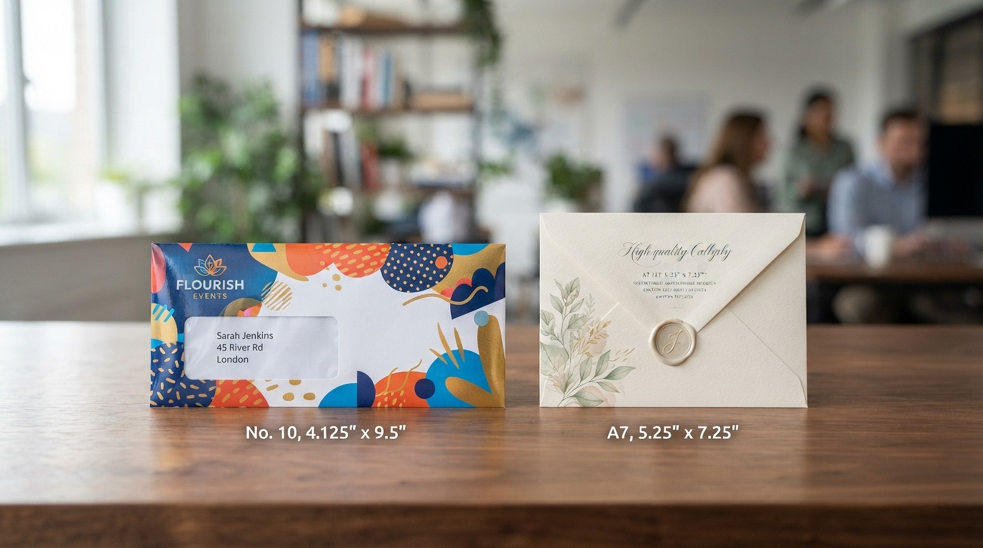
Identical artwork can look noticeably different on smooth white paper, textured stock, and kraft. Envelope paper stocks change the background color, surface, and feel beneath the printing. Choose the surface with both the design and address readability in mind.
White Wove, Recycled, and Kraft Stocks
White wove offers a generally smooth, untextured appearance and a clean surface for printing. Recycled options vary in fiber content, so the label alone does not describe the exact sheet. Kraft commonly has a brown, utilitarian appearance, though other treatments exist.
Use white wove when you want the paper to provide a neutral background for the printed design. Kraft makes the paper itself a stronger visual part of the envelope. Recycled content does not, by itself, establish a specific texture or color.
A single pound-weight number is not a reliable thickness comparison across different paper basis-weight categories. Those categories use different reference sheet sizes to calculate weight. Compare the actual stock specifications and feel rather than ranking papers by one number.
Textured, Colored, and Metallic Papers
Textured, colored, heavier, and metallic papers change how custom printed envelopes look and handle. Texture can make fine printed details appear less crisp. A colored surface also becomes part of every area where no ink covers the sheet.
Dark or metallic paper should not receive the same visibility judgment as white stock. Address ink that stands out on white may lose contrast on another surface. Metallic reflections can also change how the printed area looks as you tilt it.
Heavier paper can give a more substantial feel, but it does not replace the need for enough interior room. Review the surface and stiffness together. Printing methods must suit the chosen stock rather than relying on universal compatibility claims.
Foil, Embossing, Spot UV, and Die-Cutting
Foil stamping applies foil accents, while embossing raises a design above the paper surface. Debossing presses the design into the surface instead. Spot UV adds localized glossy areas rather than changing the whole sheet’s finish.
Custom die-cut shapes change the outline or create selected cut areas as part of the design. Keep essential mailing information on a clear, readable surface. A finish should not turn an address into a detail the reader must search for.
Match each effect to a specific design purpose rather than applying every available treatment. After choosing the surface and finish, consider how the envelope closes.
Gummed, Self-Seal, and Peel-and-Seal Closures
Moistening a flap, pressing adhesive surfaces together, and removing a release liner create three different assembly tasks. Gummed flaps require moisture to activate the adhesive. Peel-and-seal closures expose adhesive when you remove a protective liner.
Self-seal envelopes commonly close through pressure without moistening, including designs with mating adhesive surfaces. Manufacturers use closure terms inconsistently, so labels can overlap. The actual closing action matters more than the name printed in a product listing.
Match that action to the people or equipment assembling the mail. Removing liners can suit desk work but creates a separate task for every piece. A gummed design may fit a sealing process built around moisture activation.
- Moisture tolerance during assembly
- Number of envelopes closed by hand
- Compatibility with insertion or sealing equipment
- Storage conditions before use
Do not assume a closure that works easily at a desk will suit a mailing machine. Equipment must handle the flap design and activate the seal correctly. A convenient hand-closing feature can interrupt a process that expects another construction.
Heat, humidity, and storage time can affect adhesive performance without following one universal lifespan. Store unused envelopes under the conditions specified for their adhesive. Choose a closure that supports your assembly method, then settle the printed information before sealing begins.
Printing Addresses and Preparing Production Artwork
One long recipient name can break an otherwise neat address layout on custom envelopes with addresses. Variable-data printing changes fields such as names and addresses from one printed piece to the next. Reliable results depend on both the records and the space reserved for them.
Recipient Addresses and Variable-Data Printing
Structured recipient records keep names, street addresses, units, cities, states, and ZIP Codes in consistent fields. Field mapping connects each record field to the correct place in the printed layout. A swapped field can create a readable-looking address that routes nowhere useful.
Separate static return information from variable recipient information so one does not overwrite the other. Check for duplicate records before producing the mailing. Include unusually long names and address lines in the proof rather than reviewing only short examples.
A visibly correct address is not proof of deliverability because appearance cannot establish that the destination details are current. Keep data review separate from visual approval. A postal barcode comes from mailing data and is not a decorative artwork element.
Templates, Bleeds, and Print-Ready Files
An envelope artwork template must match the actual size, flap, seams, and production method. Custom printed envelopes can have different artwork limits depending on when printing occurs. Printing an assembled envelope is not the same process as printing paper before folding.
Do not place edge-to-edge artwork on a template intended for printing an already assembled envelope. The equipment may not support printing to those edges. Use bleed, artwork extending beyond a cut edge, only where the production method supports it.
Safe areas keep important text away from folds, seams, and other places that can interfere with printing. Follow the required font handling so letters do not change during file processing. Review image quality at the intended printed size rather than trusting a small screen preview.
Keep mailing information clear of decorative elements even when the artwork fits within the allowed print area. Supply files built for the chosen method rather than adapting an unrelated stationery layout. The completed design then needs a physical test and a clear ordering specification.
Choose and Order the Right Custom Envelope
Place every final insert together before choosing the specifications for your custom envelope order. The finished stack should drive the choice, not an early design draft or an empty sample. Use an envelope selection checklist to connect the physical mailpiece with the approved production details.
Measure a Finished Insert
Measure the contents after folding, assembling, and adding every enclosure. Include the reply piece, any liner, and any item that changes the stack’s thickness. Record the outer dimensions of the assembled contents rather than copying the main sheet’s design dimensions.
Check the stack at its thickest point, especially around a fold or binding. Allow room for inserting and removing the contents without bending their edges. Choose the envelope around that finished load before committing to the printed design.
Test a Complete Sample
Insert the real contents, close the flap, and gently shift the packet to assess the finished mailpiece. Check that the address stays readable and the seal lies flat. Look for catching corners, strained seams, or contents that slide into the wrong position.
An envelope print proof shows layout but cannot establish physical fit, paper feel, or adhesive performance. A digital view also cannot reproduce the appearance of every specialty finish. Use the proof for visual details and the physical sample for behavior in your hands.
Assess handling and postal suitability with the contents inside, not with the empty envelope. The completed piece may feel stiffer or thicker than the sample you first approved. Approving the correct empty envelope without loading it leaves the most important fit question unanswered.
Approve the Production Specifications
Approve a written specification that matches the tested sample and the final artwork. Keep the details together so production does not rely on scattered messages. The approval should identify these five groups of information:
- Finished dimensions and opening edge
- Stock and closure
- Print placement and finishing
- Window position or address-data method
- Quantity and required delivery date
Order cost depends on quantity, dimensions, stock, print coverage, variable addressing, and specialty finishing. A requested delivery date states your need, while a confirmed schedule establishes the agreed production and delivery timing. Do not treat a date entered on an inquiry as that agreement.
Resolve differences between the sample, proof, and written specification before approval. Approve only when the contents, address, seal, and production details work together.
Conclusion
The best envelope performs correctly with its actual contents rather than offering the most features. Practical envelope fit and reliable delivery come before decorative upgrades. An attractive empty envelope cannot compensate for bent inserts, hidden addresses, or a strained seal.
Mailing readiness starts with the assembled piece you intend to send. Keep that sample beside the artwork so a visual change does not quietly undo a working fit. A liner, extra card, or revised fold can change the result.
Assemble one complete mailpiece with the final contents. Use it to approve the envelope specification before placing your order.
FAQ
What are five different types of envelopes?
Commercial, A-style, baronial, booklet, and catalog envelopes are five common examples, not an exhaustive classification. Commercial styles suit business mail, while A-style and baronial styles often carry social stationery. Booklet and catalog styles differ by opening edge. Naming the style still leaves dimensions, closure, and printing to choose.
How many types of envelopes are there?
There is no universal count because style, size, window configuration, and closure describe overlapping features. Seven common families are commercial, A-style, baronial, square, booklet, catalog, and remittance. A windowed commercial envelope with peel-and-seal does not become three separate styles. A useful order description combines the relevant features instead of selecting only one label.
What’s the difference between A5 and C5 envelopes?
ISO A5 names a 148 x 210 mm paper size, while C5 names a 162 x 229 mm envelope. C5 holds A5 paper unfolded. An “A5 envelope” label can informally mean an envelope intended for that sheet. Use the actual envelope dimensions to distinguish a fit description from a formal size designation.
Which is bigger, C5 or C6?
C5 is larger at 162 x 229 mm, while C6 measures 114 x 162 mm. C5 holds unfolded A5 paper, and C6 holds unfolded ISO A6 paper. For an A4 sheet, C5 needs one fold and C6 needs two folds to quarter size. The choice changes how much folding the recipient encounters.
What are C6 envelopes?
C6 envelopes measure 114 x 162 mm and commonly hold ISO A6 paper or A4 folded twice to quarter size. They provide a compact format for smaller stationery. The dimensions describe the envelope, not the insert. Added cards or thick folded contents still need enough clearance to enter the pocket without catching.
What is a C4 envelope used for?
A C4 envelope measures 229 x 324 mm and holds A4 documents without folding. It suits reports and correspondence that should remain flat. The format preserves the sheet’s unfolded presentation, but it does not guarantee room for any thickness. A bound report needs a capacity check as well as a face-dimension match.
What is an A6 envelope?
A U.S. A6 announcement envelope measures 4 3/4 x 6 1/2 inches. ISO A6 instead names paper measuring 105 x 148 mm. A listing may use A6 for the American envelope or compatibility with the international sheet. Confirm the sizing system through the dimensions, especially when matching stationery bought from different retailers.
Are A6 and C6 envelopes the same?
No, a U.S. A6 envelope and a C6 envelope use different dimensions and sizing systems. U.S. A6 measures 4 3/4 x 6 1/2 inches, while C6 measures 114 x 162 mm. C6 accommodates ISO A6 paper. The shared number does not make the two envelope formats interchangeable for a particular invitation set.

Leave a Reply